
Free checklist · 284 points
Fix every leak between a visit and an order.
The 284-point audit our team runs on every new store: homepage, product page, cart, checkout. Each point is scored by effort and impact, so the cheap fixes that pay back fastest come first.
Getting Traffic
0/37 completedWebsite
0/28 completed- ImplementationeasyImpacthigh
What it is about?
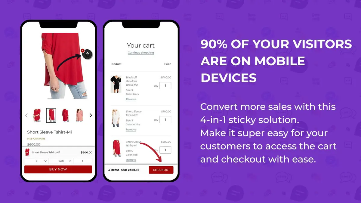
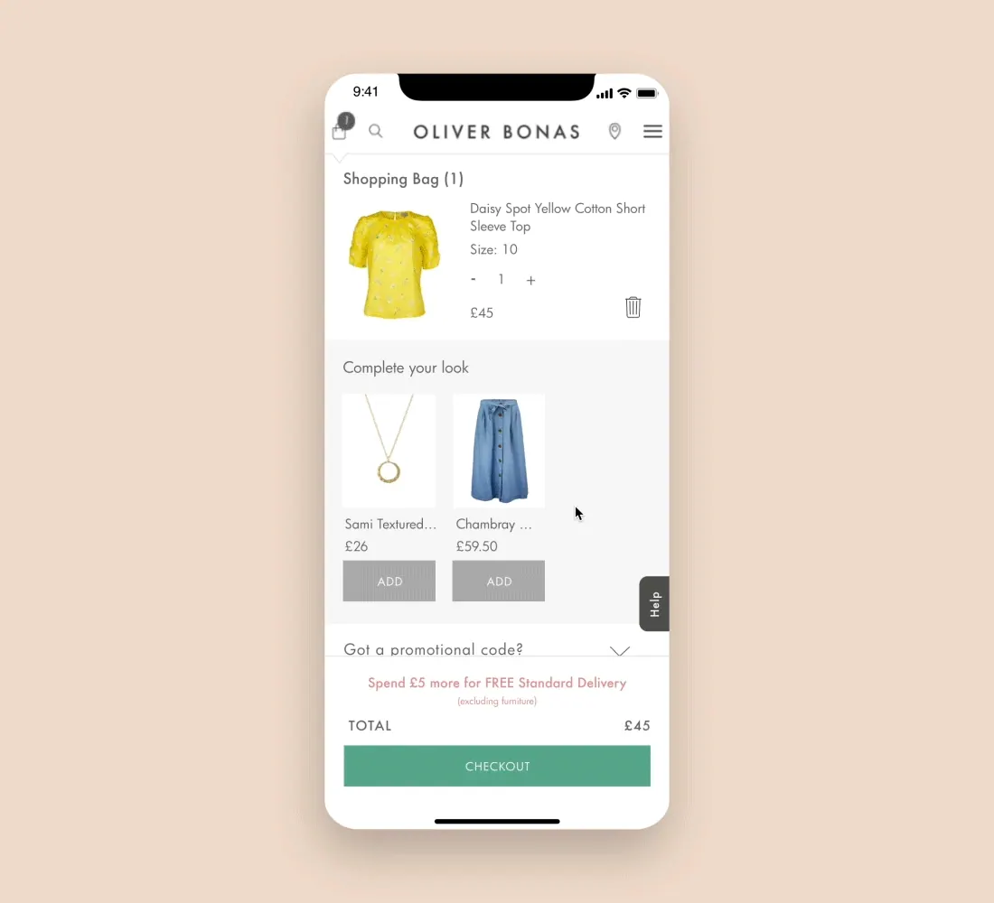
Keep the call-to-action (CTA) button fixed at the bottom of mobile screens for easy access.
Mobile users often scroll through content vertically, and having the CTA button consistently present eliminates the need for excessive scrolling to locate it. This convenience reduces friction and eliminates the risk of users missing the desired action.
By providing a fixed CTA button at the bottom of mobile screens, you streamline the user journey, encourage engagement, and increase the likelihood of conversions, ultimately maximizing the effectiveness of your mobile marketing efforts.Examples
- ImplementationeasyImpacthigh
What it is about?
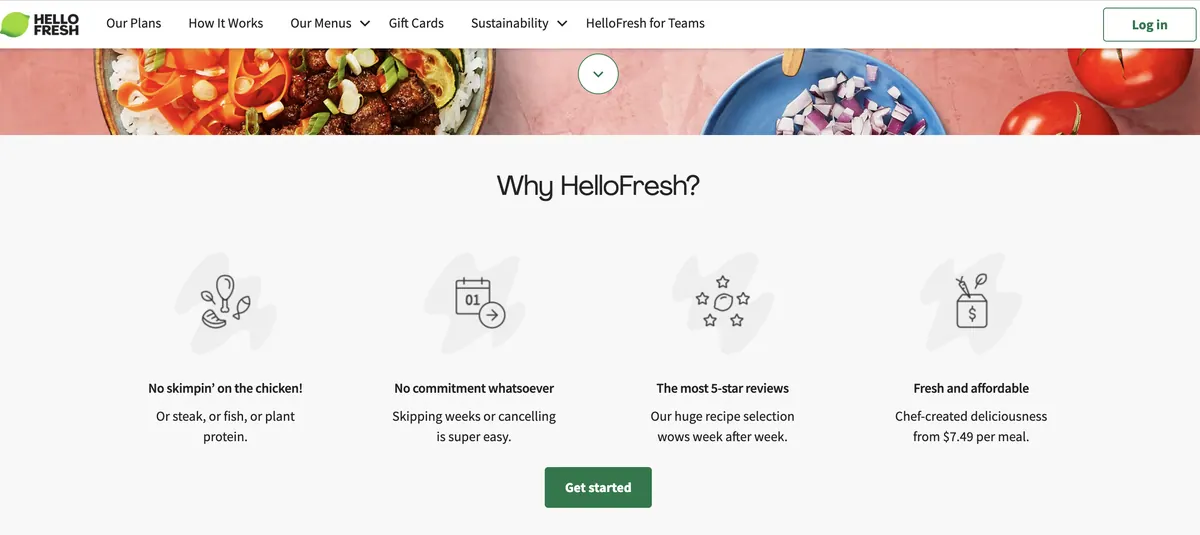
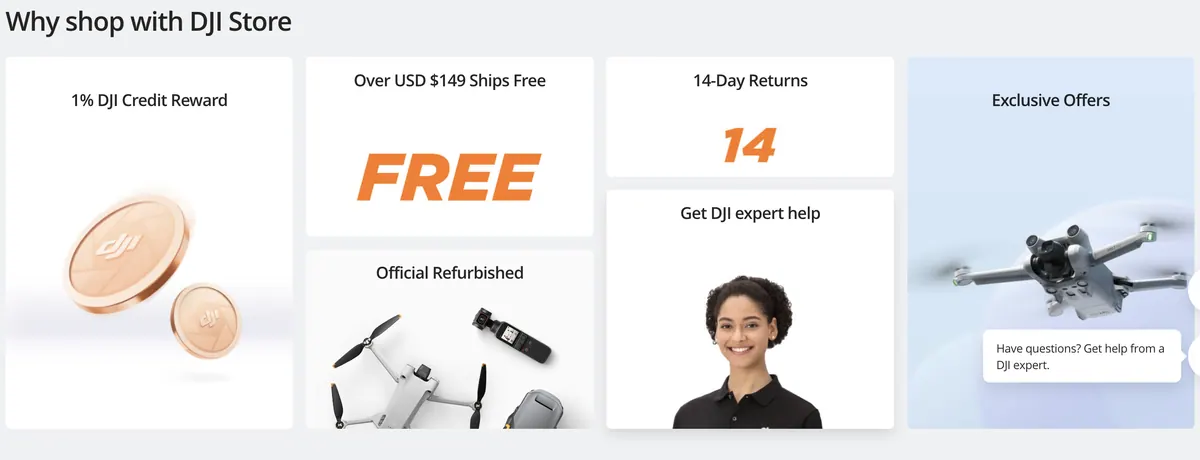
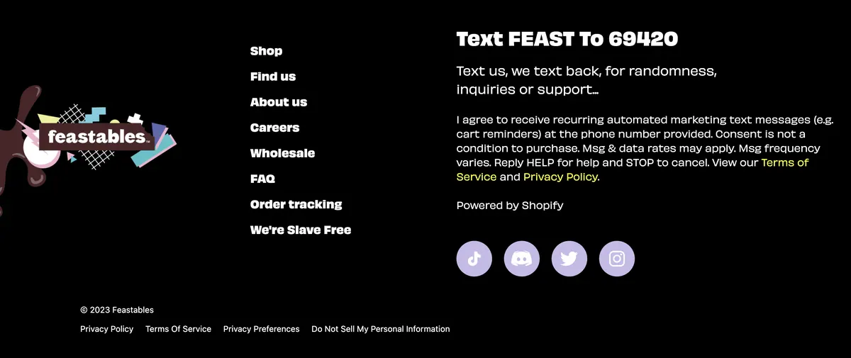
Highlight the main benefits of shopping with your store, such as ethical practices, charitable giving, or shipping success, in a dedicated "Why Us" section on the home page.
This section provides an opportunity to build trust, showcase your values, and address any potential concerns or questions visitors may have. By clearly conveying the benefits of shopping with your store, you establish a strong value proposition, create a connection with your target audience, and increase the likelihood of converting visitors into loyal customers.
By highlighting benefits, you differentiate your brand and appeal to customers who prioritize these factors.Examples
- ImplementationeasyImpacthigh
What it is about?
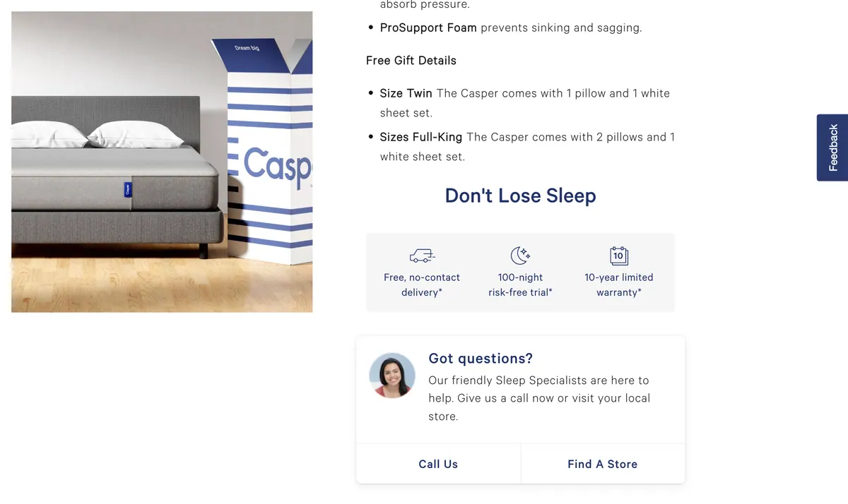
Provide customers with options to contact the store, such as live chat, email, or phone number, on the home page.
Offering multiple contact options on the home page improves customer satisfaction and facilitates seamless communication between your business and potential customers. Live chat enables real-time assistance, addressing queries promptly and enhancing the overall user experience. Email provides a convenient and asynchronous communication channel, allowing customers to reach out at their convenience. Displaying a phone number instills confidence and reassures customers that they can easily connect with a real person if needed.
By providing various contact options, you demonstrate your commitment to customer support, build trust, and increase the likelihood of conversions by addressing customer inquiries and concerns effectively.Examples
- +22 more in WebsiteUnlock all free →
General
0/40 completed- ImplementationeasyImpacthigh
What it is about?
Ensure main pages (homepage, landing page, product page) have fast load times of under 5 seconds.
Faster page load times contribute to better user experience, improved conversion rates, and enhanced SEO. When pages load quickly, users are more likely to engage with your website and take the desired actions, such as making a purchase or filling out a form. Slow-loading pages can lead to user frustration, increased bounce rates, and potential loss of customers. Additionally, search engines like Google prioritize websites with faster load times, resulting in higher search rankings and increased organic traffic.
By investing in website optimization techniques like image compression, caching, and code optimization, you can ensure that these pages load quickly and efficiently. This will not only benefit your users but also positively impact your SEO efforts and ultimately contribute to the success of your online business.You can check your loading times here: https://pagespeed.web.dev/
- ImplementationeasyImpacthigh
What it is about?
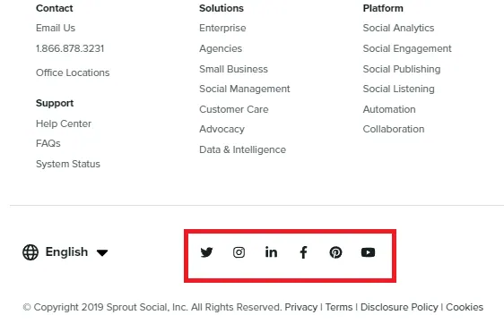
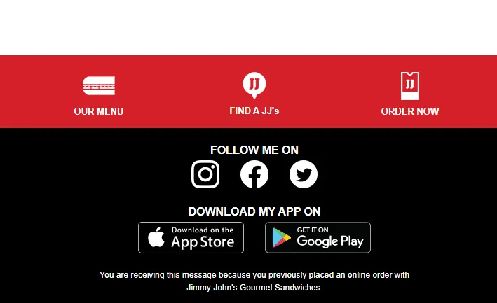
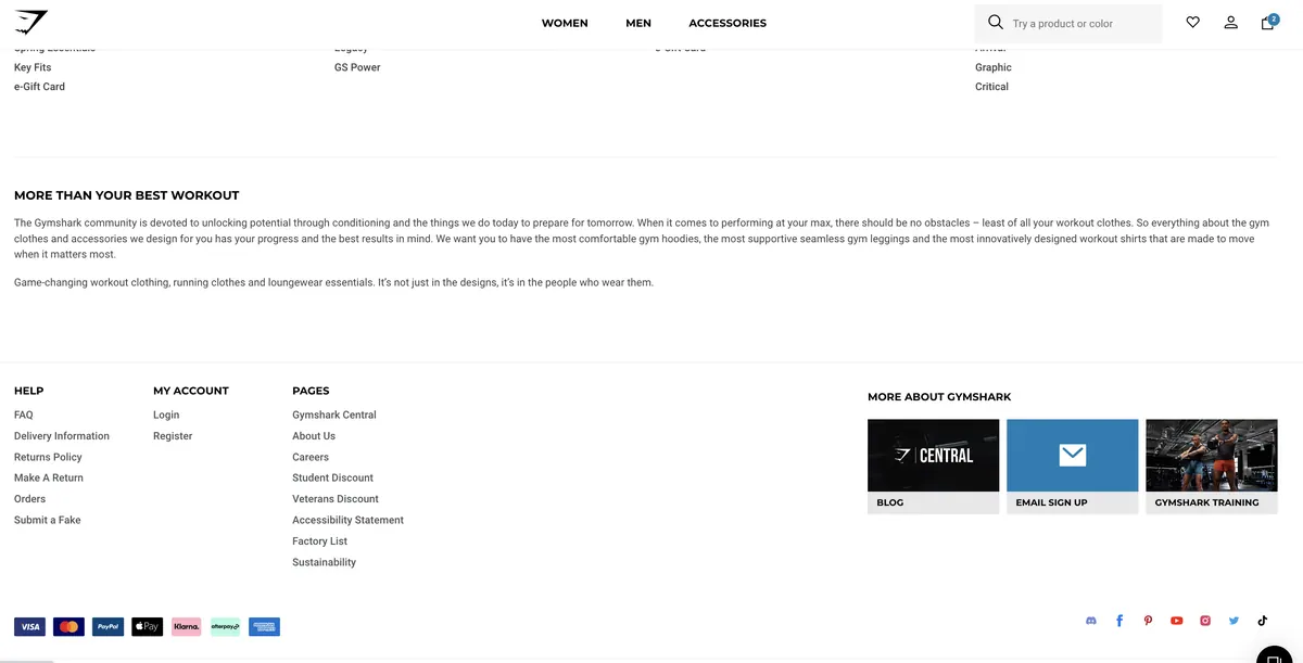
Include links to social networks and display the total number of likes/followers in the footer.
Including links to social networks in the footer allows users to easily connect with your brand on popular social media platforms. This helps to strengthen your online presence, engage with your audience, and build a community around your brand. Displaying the total number of likes/followers provides social proof and allows users to verify the company's trustworthiness. It showcases the popularity and reach of your brand on social media, which can instill confidence in potential customers and encourage them to follow or engage with your brand on these platforms.
By including links to social networks and displaying the total number of likes/followers in the footer, you provide an opportunity for users to connect with your brand on social media and verify your company's trustworthiness. This can enhance your online presence, build a community, and boost customer engagement and loyalty.Examples
- ImplementationeasyImpacthigh
What it is about?
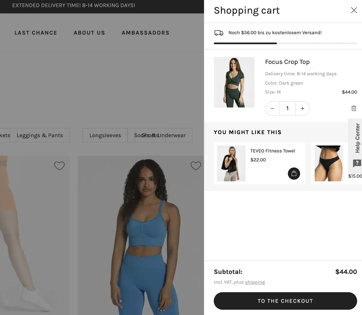
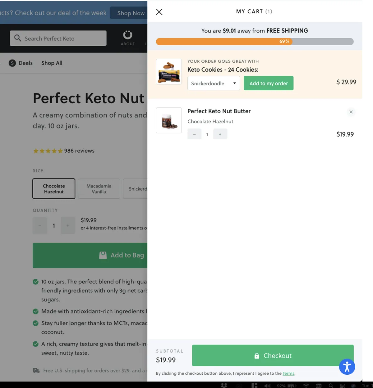
Ensure that the cart widget clearly shows the user's progress toward qualifying for free shipping if the store offers this promotion.
Displaying the user's progress toward qualifying for free shipping in the cart widget serves as a powerful motivator for users to add more items to their cart. It creates a sense of goal achievement and encourages users to increase their order value to take advantage of the free shipping offer. By making this information easily visible, users are more likely to make additional purchases to reach the threshold, which can lead to increased order values and customer satisfaction.
By incorporating a clear indication of the user's progress toward qualifying for free shipping in the cart widget, the store leverages the promotion to drive higher order values and increase customer satisfaction. It effectively communicates the benefit of free shipping and encourages users to add more items to their cart to meet the threshold, resulting in a positive impact on sales and customer experience.Examples
- +34 more in GeneralUnlock all free →
Landing Page
0/39 completed- ImplementationeasyImpacthigh
What it is about?
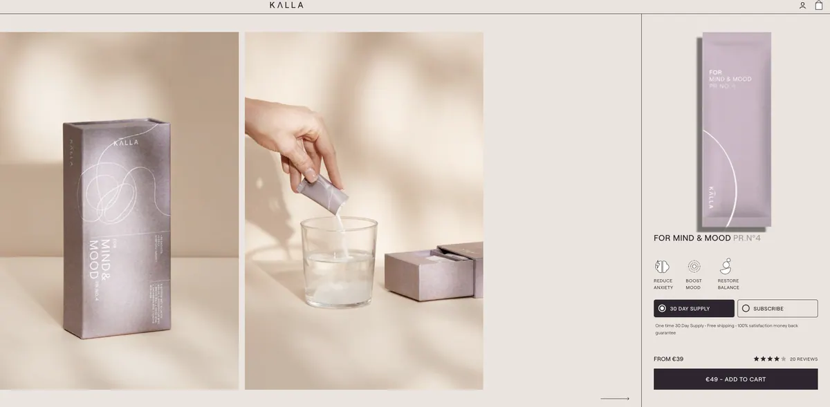
Make the background color of the product's primary call-to-action (CTA) differ from other elements.
By using a distinct background color for the primary CTA, you draw attention to it and make it visually stand out. This helps users quickly identify the desired action they need to take, such as adding the product to their cart or initiating the purchase process.
A contrasting background color for the CTA helps communicate that it is a clickable element and encourages user interaction. It provides a clear visual cue that prompts users to engage with the CTA, improving the overall usability and user experience.
By implementing a distinct background color for the primary CTA, you create visual prominence, guide users' attention, and facilitate their interaction with the most important action on the product page. This enhances usability, conversion rates, and overall user satisfaction.Examples
- +35 more in Landing PageUnlock all free →
Category Page
0/32 completed- ImplementationeasyImpacthigh
What it is about?
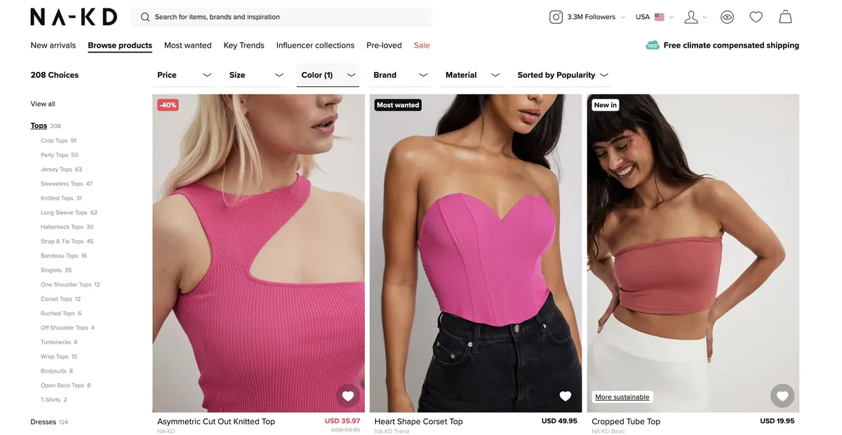
Implement real-time updating of the category page using AJAX when a filter is selected.
Real-time updating of the category page provides immediate feedback to users when they select a filter, creating a seamless and responsive browsing experience. By utilizing AJAX technology, the category page can dynamically update without requiring a full page refresh, allowing users to see the filtered results instantaneously. This enhances user engagement and reduces frustration by eliminating the need for manual page reloading.
The ability to see the filtered results instantly improves usability and satisfaction, enabling users to efficiently explore and find the products that match their preferences.
Examples
Before the filter:
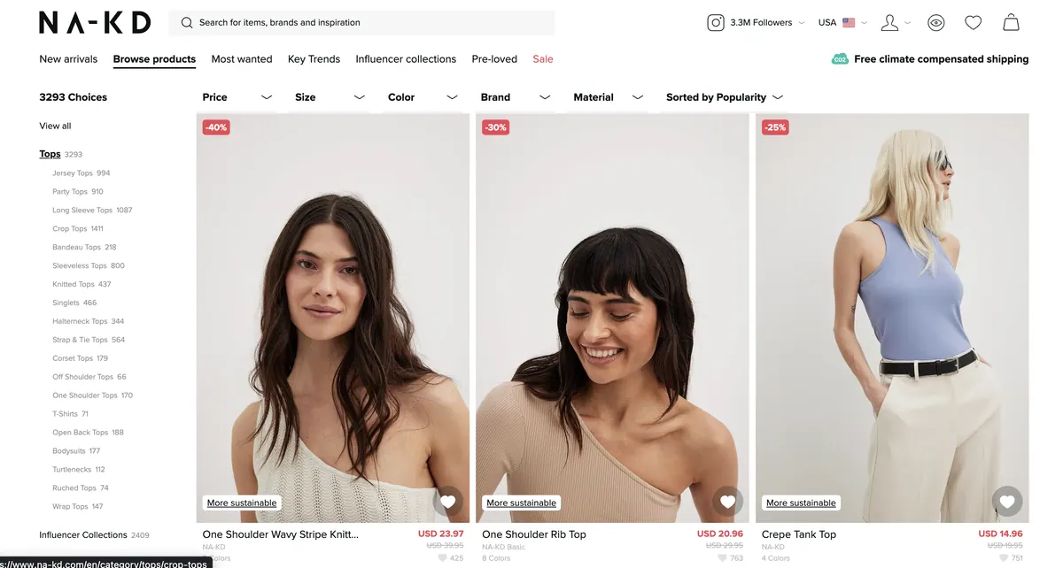
On selecting pink color filter, immediate results are shown
- ImplementationeasyImpacthigh
What it is about?
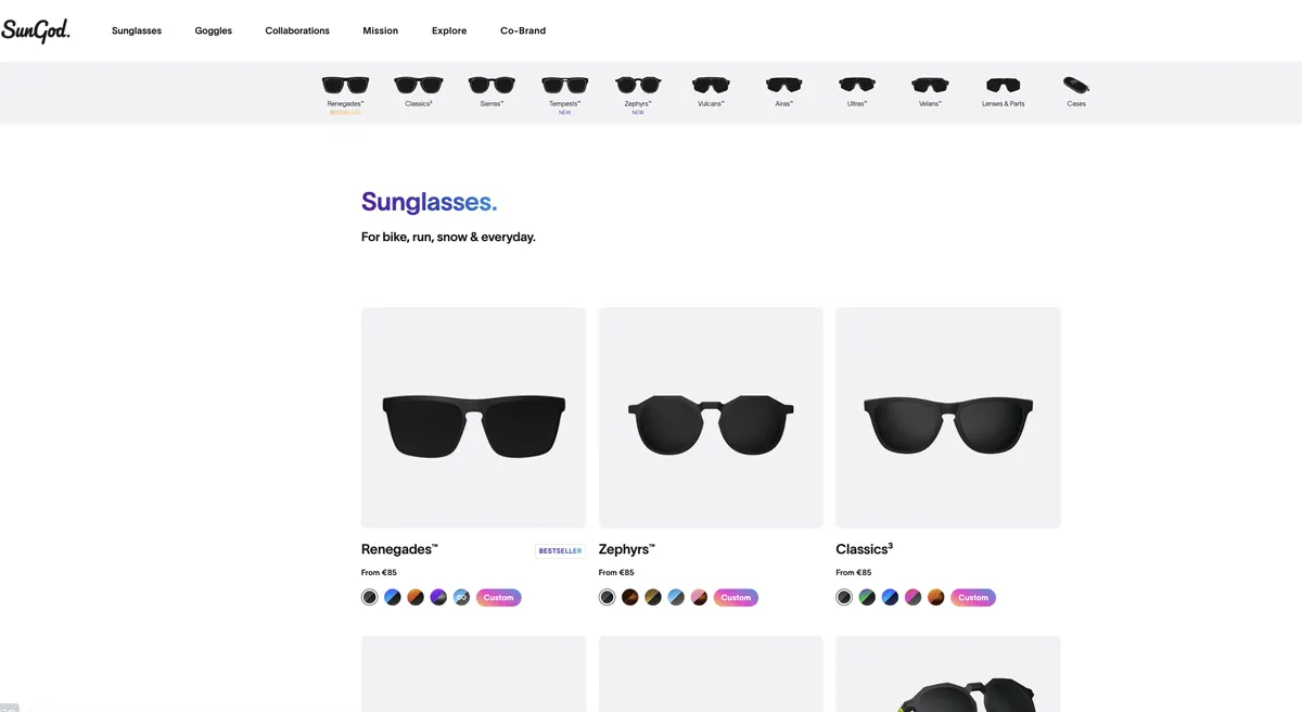
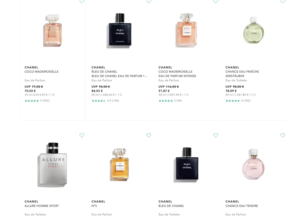
Employ appropriate design on the category page, such as grid view for image-focused decisions and list view for product attribute-focused decisions.
Grid view is effective for users who prioritize visual appearance, allowing them to quickly scan visually appealing layouts. List view is beneficial for users who prioritize product attributes and specifications, enabling them to compare details and make informed decisions.
Offering both grid view and list view options caters to diverse user preferences, improves browsing experience, and supports informed decision-making on the category page.
Examples
- +27 more in Category PageUnlock all free →
Product Page
0/31 completed- ImplementationeasyImpacthigh
What it is about?
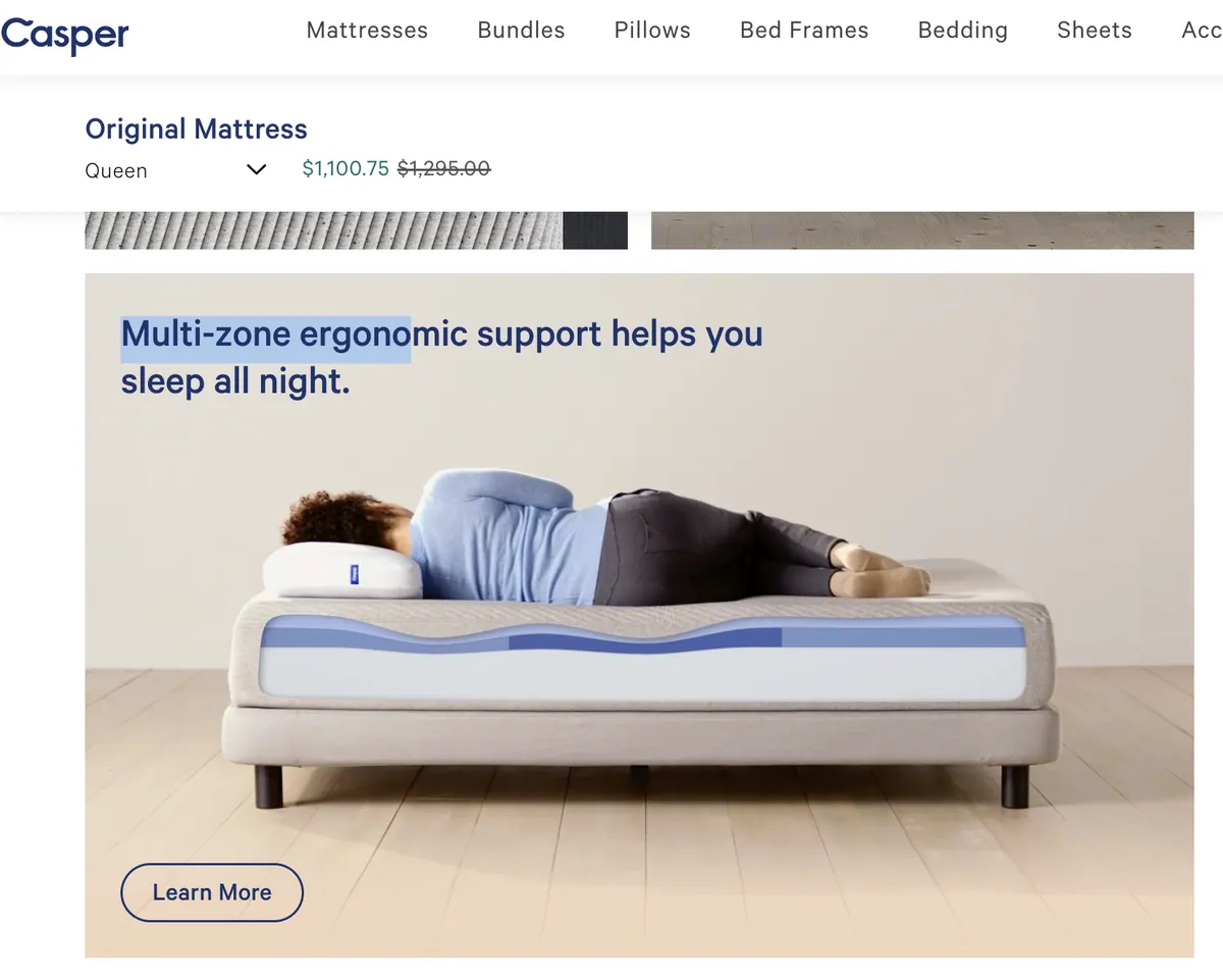
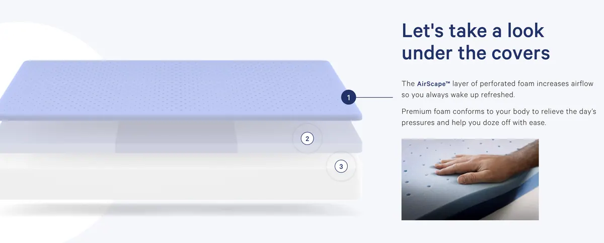
Add captions to PDP hero images to clarify features and ensure users focus on the intended highlights.
Including captions on PDP hero images helps provide additional context and clarity to users. Captions can highlight specific features, benefits, or important details that may not be immediately apparent from the image alone. This helps guide users' attention and ensures they understand the key selling points or unique aspects of the product. Captions are especially valuable for close-up shots or images depicting the product in real-life situations, where additional explanations can enhance the user's understanding and appreciation of the product.
Captions are an effective tool for enhancing visual content and reinforcing key selling points, ultimately increasing user engagement and driving conversions.
Examples
- +27 more in Product PageUnlock all free →
Cart
0/31 completed- ImplementationeasyImpacthigh
What it is about?
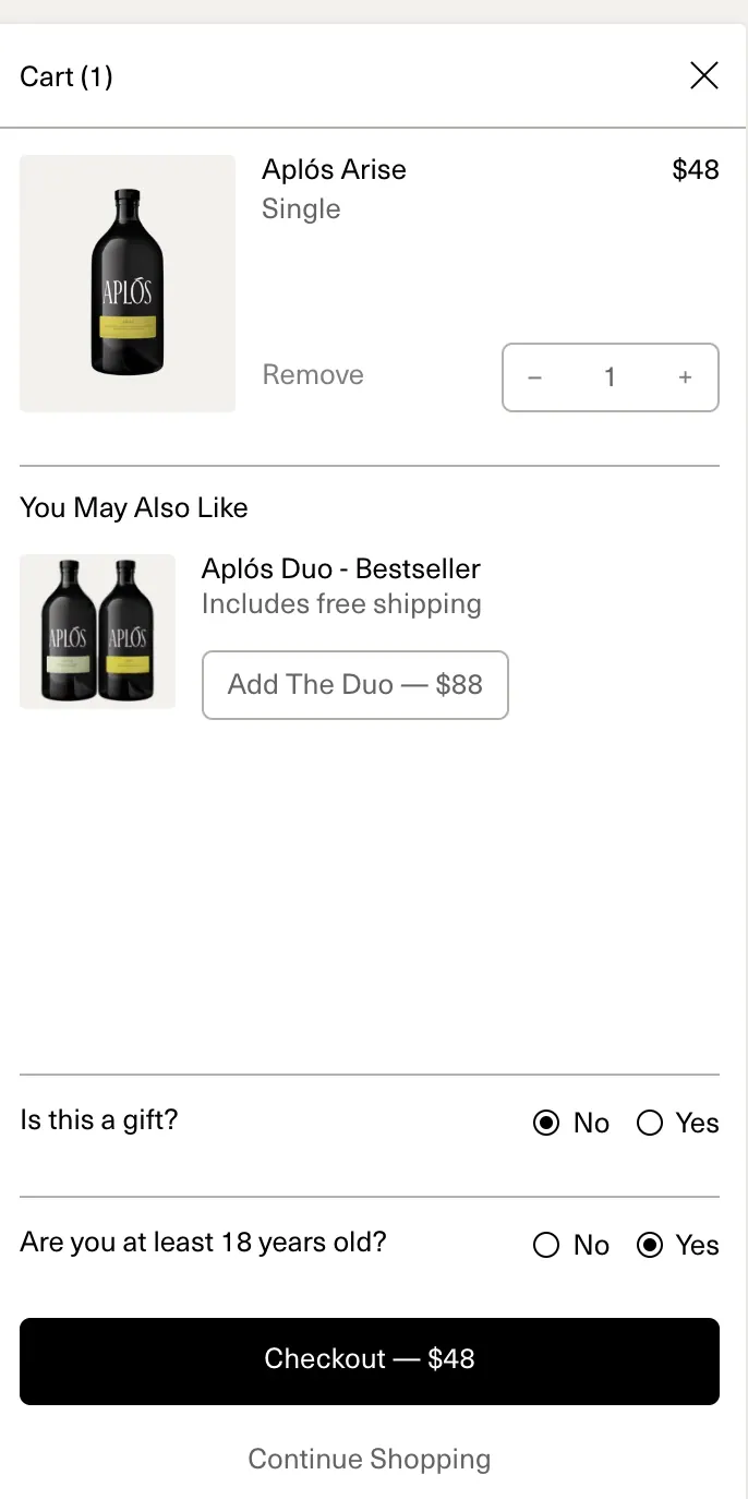
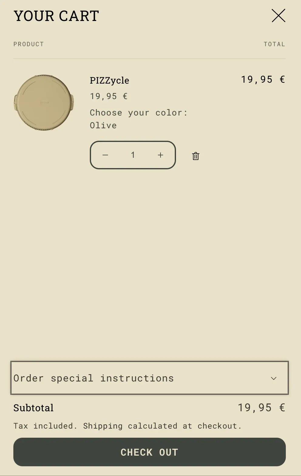
Include what will happen next ("Proceed to a secure checkout") in the main call-to-action (CTA) and make it the most prominent element on the page. Duplicate the CTA at the top and bottom of the page.
Including a clear and descriptive statement in the main CTA, such as "Proceed to a secure checkout," informs the user about the next step in the process, setting clear expectations and reducing uncertainty. By making the CTA the most prominent element, it attracts the user's attention and guides them towards taking action.
Duplicating the CTA at the top and bottom of the page ensures that it remains easily accessible regardless of where the user is on the page. This allows for a seamless user experience, eliminating the need for scrolling back up to proceed to checkout.
This streamlined approach improves the user experience and reduces friction, ultimately increasing the likelihood of conversions.
Examples
- ImplementationeasyImpacthigh
What it is about?
Implement automatic cart updates when users change product quantities, eliminating the need for an "update cart" button.
Automatic cart updates streamline the user experience by instantly reflecting changes in product quantities without requiring users to manually click an "update cart" button. This functionality reduces friction and improves efficiency during the shopping process. By eliminating the extra step of clicking an "update cart" button, you create a more seamless and intuitive user interface. Users can easily adjust product quantities, and the cart dynamically updates in real time, providing immediate feedback. This not only saves time but also enhances user satisfaction by eliminating any confusion or frustration associated with manually updating the cart. Automatic cart updates also contribute to the accuracy of order information. Users can trust that the quantities they see in the cart are up to date, reducing the likelihood of errors or discrepancies during the checkout process. This transparency instills confidence in users and reinforces the reliability of your e-commerce platform.
By providing a seamless and efficient cart management system, you enhance user satisfaction and increase the likelihood of successful conversions.Examples
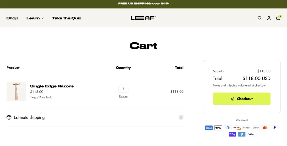
On changing the quantity, the cart is automatically updated along with the subtotal - ImplementationeasyImpacthigh
What it is about?
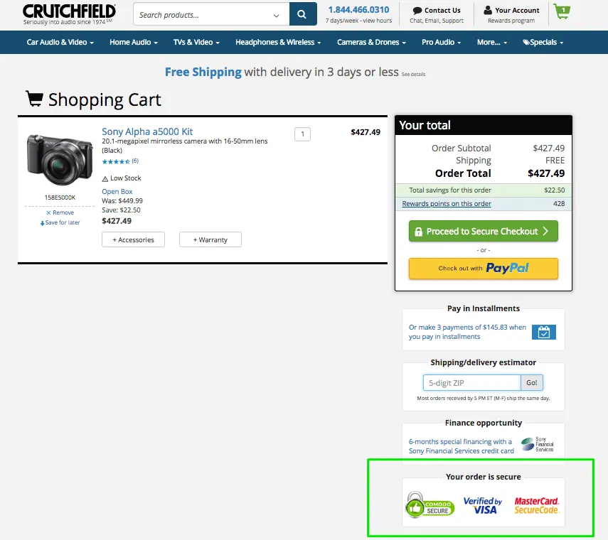
Place a trust icon or seal badge (e.g., verified by Norton) below the main call-to-action (CTA) and accompany it with reassuring copy such as "Shop with confidence."
Including a trust icon or seal badge below the main CTA helps to instill trust and credibility in the minds of users. These trust symbols serve as visual indicators that your website is secure and reliable, giving users the confidence to proceed with their purchase. By positioning it below the CTA, it reinforces the message that shopping with your store is safe and trustworthy. The accompanying reassuring copy, such as "Shop with confidence," further strengthens the trust-building message. It assures users that their personal information and transactions are protected, enhancing their overall shopping experience.
This can help alleviate any concerns they may have about security and encourage them to complete their purchase with peace of mind.
Examples
- +25 more in CartUnlock all free →
Checkout
0/38 completed- ImplementationeasyImpacthigh
What it is about?
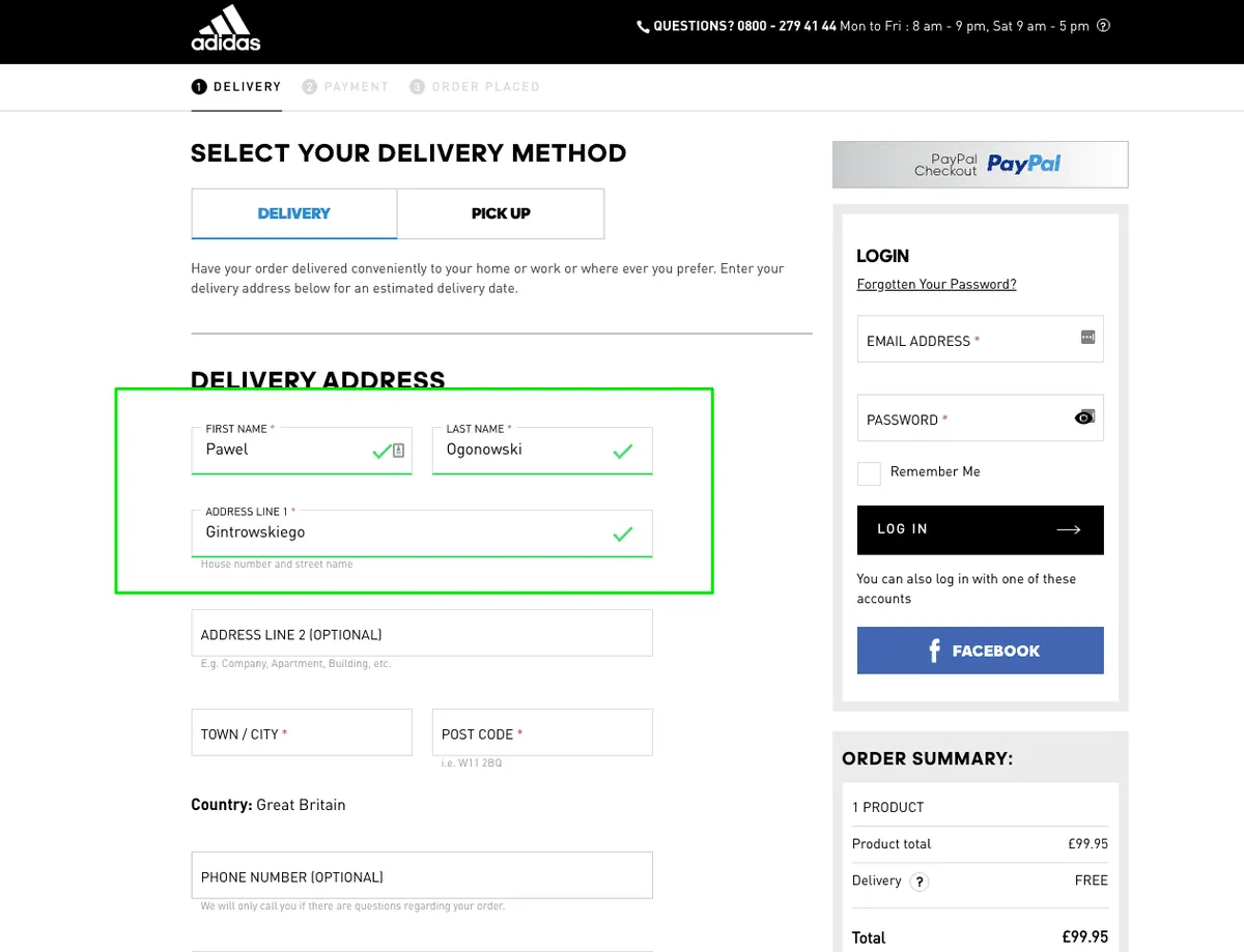
Implement "floating labels" for the input fields on the checkout page, allowing users to see the field name and its contents simultaneously.
Using "floating labels" in the checkout page input fields improves the usability and clarity of the form. With floating labels, the field name or label is displayed within the input field itself, and it floats above the input when the user starts typing or when there is content in the field. This approach provides a seamless and unobtrusive way to present the field labels, as they remain visible while users enter their information. By incorporating floating labels, users can easily identify each input field's purpose and provide relevant information without confusion.It eliminates the need for separate labels beside the fields, reducing visual clutter and enhancing the overall aesthetics of the checkout page.
Examples
- ImplementationeasyImpacthigh
What it is about?
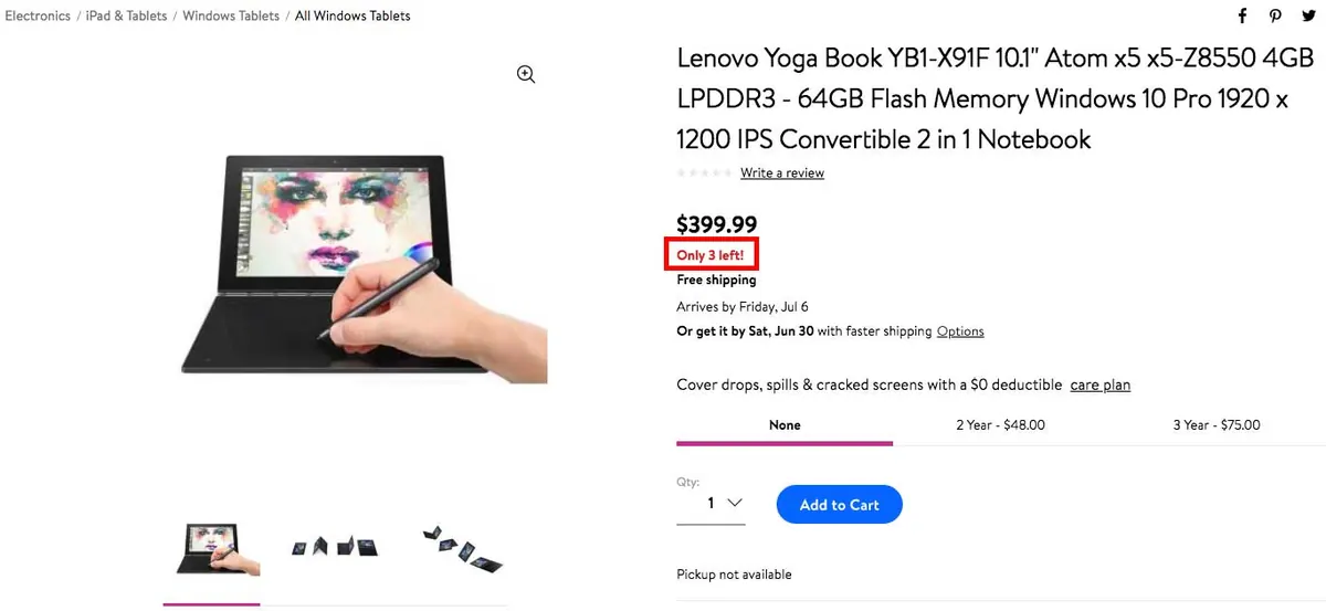
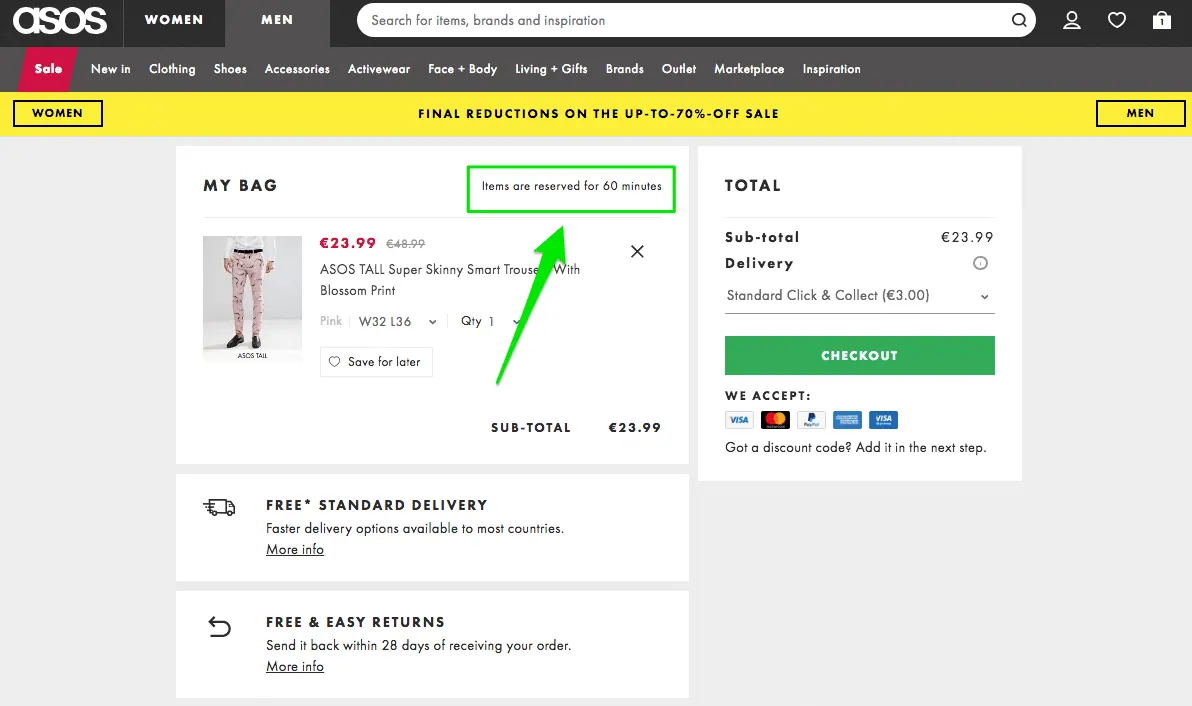
Boost conversions by creating urgency through three methods: quantity limitations, time limitations, and contextual limitations.
Creating a sense of urgency is a powerful technique to motivate customers to take immediate action and increase conversions. By incorporating quantity limitations, such as displaying the remaining stock or available rooms, you create a fear of missing out (FOMO) and prompt customers to make a decision quickly. Time limitations, such as limited-time discounts or reservation durations, create a sense of urgency by signaling that the offer will expire soon. This drives customers to take action before they potentially lose the opportunity. Contextual limitations, such as highlighting upcoming events or showing real-time engagement indicators, leverage social proof and urgency to encourage immediate purchases.
By instilling a sense of urgency, you prompt customers to make a purchase decision quickly, increasing the likelihood of conversion.
Examples
- ImplementationeasyImpacthigh
What it is about?
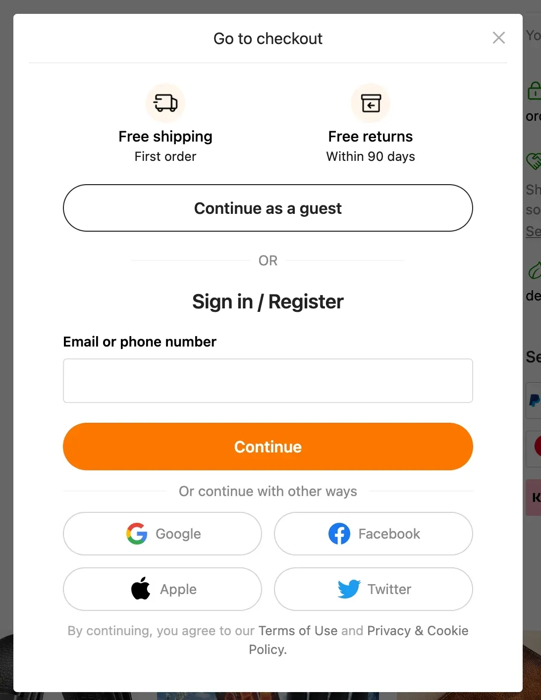
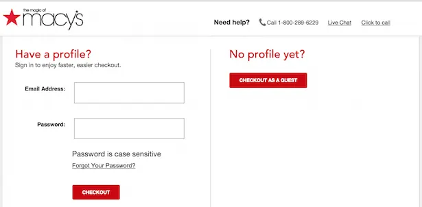
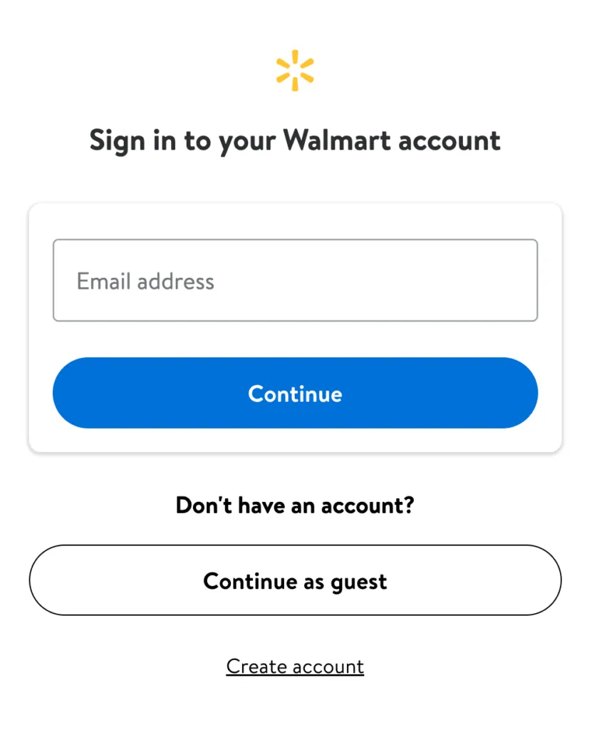
Enable the guest checkout option to allow users to make a purchase without mandatory registration.
Offering a guest checkout option removes unnecessary barriers and friction from the purchasing process. Not all users may be willing to create an account or go through a registration process, especially for one-time or spontaneous purchases. By providing the option to complete a purchase as a guest, you streamline the checkout experience and cater to the needs of these users. Allowing guest checkout improves the overall user experience by reducing the steps required to complete a purchase. It eliminates the need for users to provide personal information or create an account, making the process faster and more convenient.
This can help prevent cart abandonment and increase conversion rates, especially for users who value a quick and hassle-free checkout experience.
Examples
- ImplementationeasyImpacthigh
What it is about?
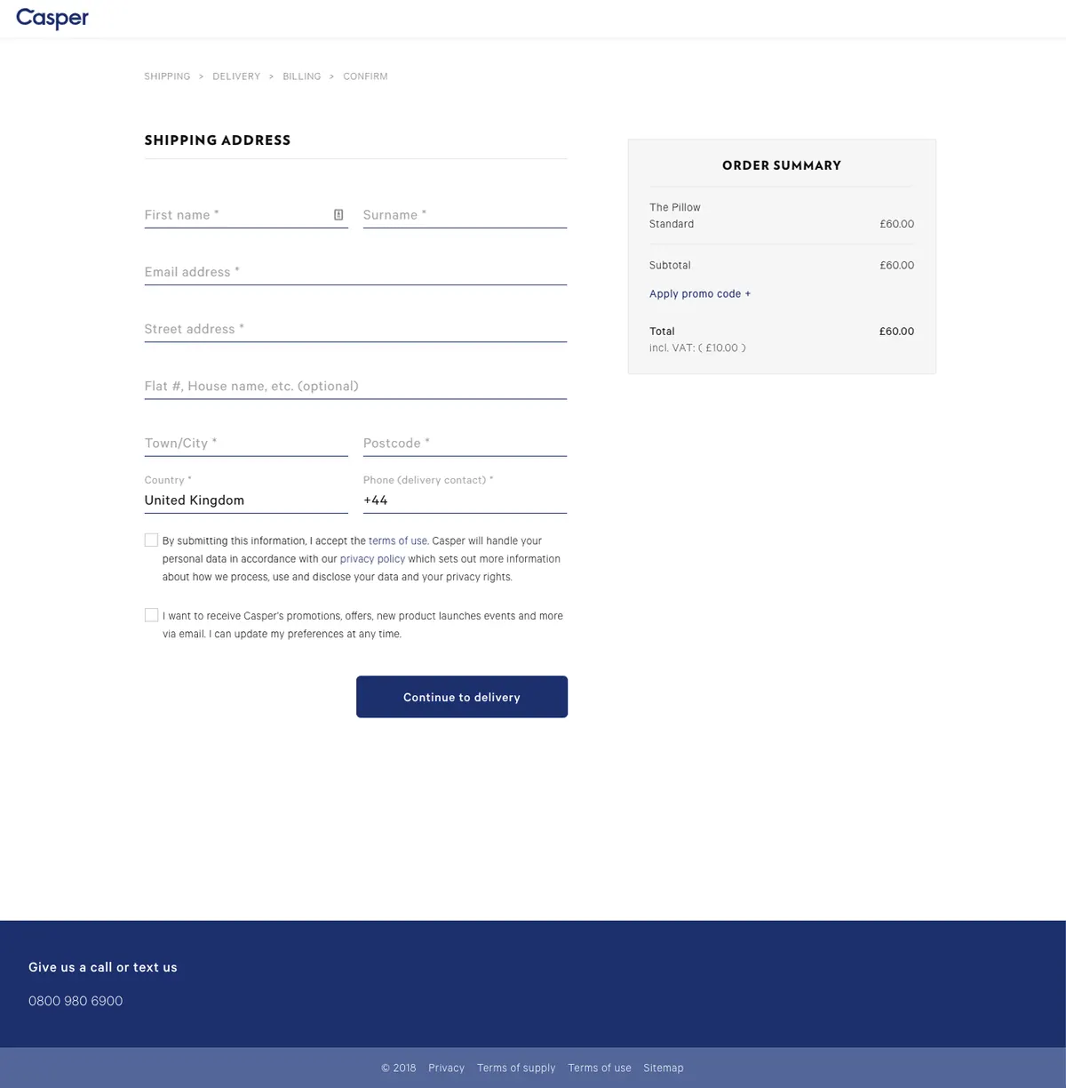
Create a distraction-free checkout "tunnel" by removing header and footer elements.
Removing header and footer elements during the checkout process helps create a focused and streamlined experience for users. By eliminating unnecessary distractions, such as navigation menus and promotional banners, users are more likely to stay engaged and focused on completing their purchase. This simplification of the checkout page reduces cognitive load and increases the likelihood of users proceeding with the checkout process.
Examples
- ImplementationeasyImpacthigh
What it is about?
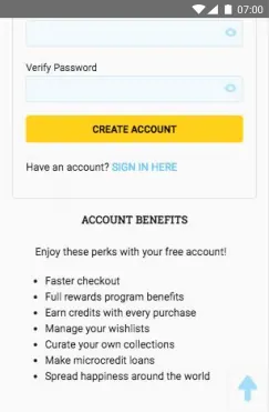
While not requiring account creation during checkout, promote its benefits to entice users to create accounts voluntarily.
Encouraging account creation during checkout can significantly enhance the overall shopping experience for users. By creating an account, customers can benefit from streamlined future purchases, quick access to order history and tracking information, personalized recommendations, and exclusive offers. Additionally, having an account allows for easier customer support and the ability to save payment and shipping information for faster checkout in the future. By promoting the benefits of account creation, businesses can foster long-term customer loyalty and improve the overall shopping journey.
Examples
- +30 more in CheckoutUnlock all free →
Thank You
0/8 completed- ImplementationeasyImpacthigh
What it is about?
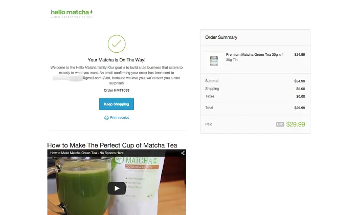
Provide a concise summary of the order on the thank you page.
Including a summary of the order on the thank you page is essential for providing customers with a quick and convenient reference to their purchase details. After completing a transaction, customers appreciate having a clear and concise summary of the items they have ordered, along with relevant information such as quantities, pricing, and any additional options or customizations. This summary serves as a confirmation of their selections and allows them to quickly review the order for accuracy.
This is how you can streamline the post-purchase experience, reduce customer inquiries, and enhance overall satisfaction.Examples
- ImplementationeasyImpacthigh
What it is about?
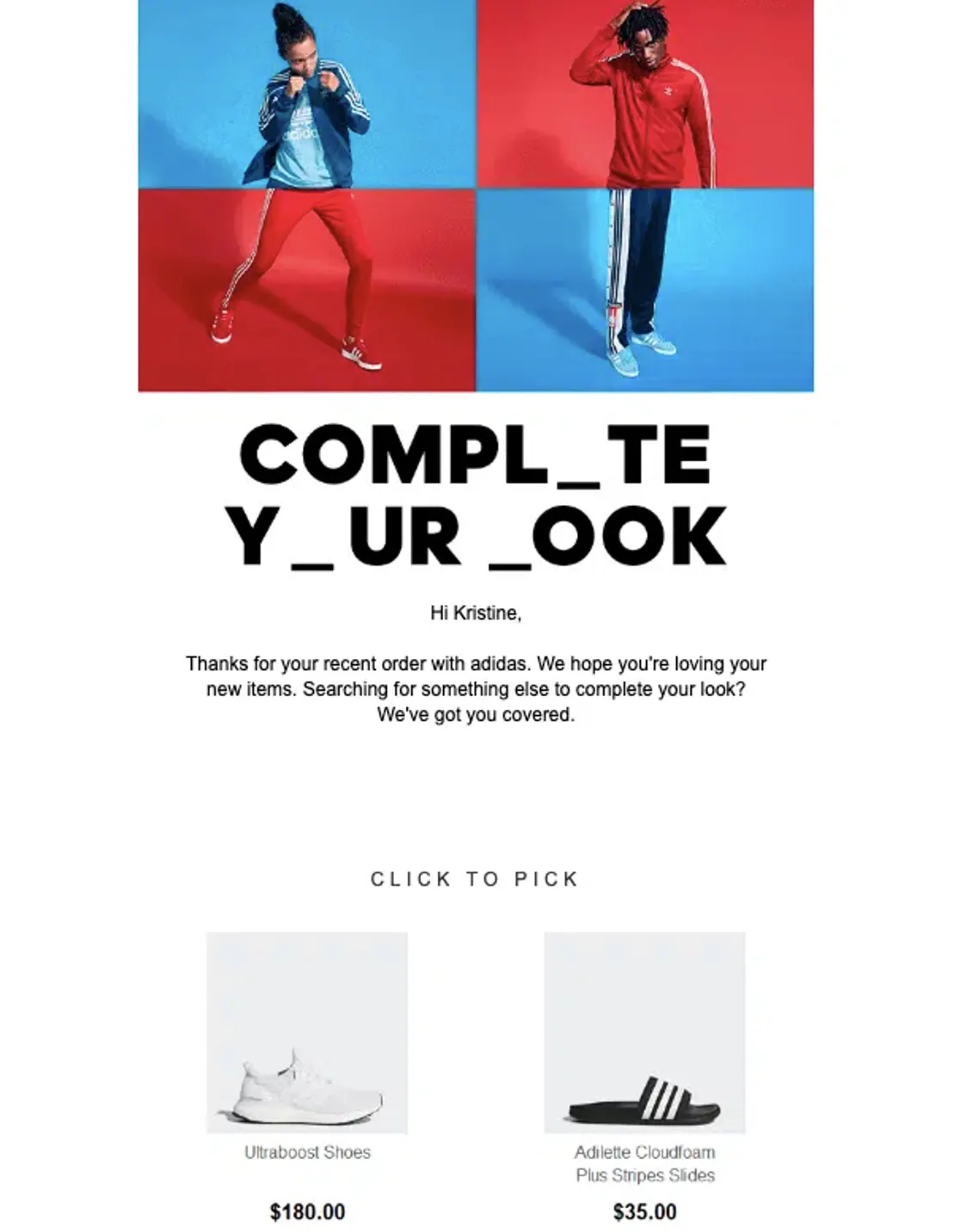
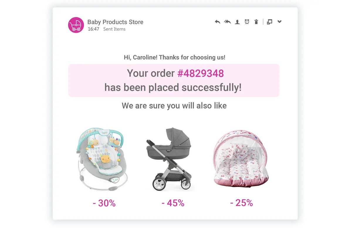
Send a confirmation of the purchase to the customer, including an upselling or cross-selling call-to-action (CTA) to increase average order value (AOV).
Sending a confirmation of the purchase to the customer is a crucial step in providing a positive post-purchase experience. It assures customers that their order has been successfully processed and helps build trust in your brand. By including an upselling or cross-selling CTA within the confirmation email, you have an opportunity to increase the AOV. Presenting relevant additional products or services that complement the customer's purchase can encourage them to make additional purchases or upgrades.
This approach not only increases revenue but also enhances the overall customer experience by offering personalized recommendations and showcasing the value of related offerings.Examples
- +3 more in Thank YouUnlock all free →
Questions
About the CRO checklist
The short answer
The Shopify CRO checklist is the 284-point audit our team runs on every new store. It covers every leak between a visit and an order, in 9 categories from getting traffic to the thank-you page. Each point is scored by effort and impact, so the cheap fixes that pay back fastest come first.
- Who it’s for
- Indian D2C founders whose store gets visits but not enough orders.
- How it works
- Start with the top 20, tick as you fix, then unlock all 284 free.
What is a Shopify CRO checklist?
It is a list of everything on your store that can cost you an order. This one has 284 points in 9 categories: getting traffic, landing page, category page, product page, cart, checkout, thank-you page, website and general.
Where should I start?
With the top 20, open on this page. Within each category, points are sorted by ease × impact, and 41 of them are quick wins: easy to do and high impact.
How long does it take?
The easiest points take about 30 minutes and the hardest about a day. Every point is tagged by how hard it is to implement and how much it moves revenue, and each category shows your progress.
Is the checklist free?
Yes. We used to sell it. The top 20 are open now, and all 284 unlock free when you add your WhatsApp and email.
Can your team do this for my store?
Yes. Our team at Bizgrowth Ninja can run this checklist on your store. Tell us where it hurts and we’ll route you to the right person.
Done for you
Want us to apply this on your store?
We used to sell this checklist. Now it’s free. If you’d rather have our team at Bizgrowth Ninja run it on your store, tell us where it hurts.